Category Archives: sculpture

Louise Bourgeois 1911-2010

Louise Bourgeois (the last great artist of the twentieth century?) is dead.


Holland Cotter in the New York Times:

Ms. Bourgeois’s sculptures in wood, steel, stone and cast rubber, often organic in form and sexually explicit, emotionally aggressive yet witty, covered many stylistic bases. But from first to last they shared a set of repeated themes centered on the human body and its need for nurture and protection in a frightening world.

Protection often translated into images of shelter or home. A gouged lump of cast bronze, for example, suggested an animal’s lair. A tablelike wooden structure with thin, stiltlike legs resembled a house ever threatening to topple. Her series of “Cells” from the early 1990s — installations of old doors, windows, steel fencing and found objects — were meant to be evocations of her childhood, which she claimed as the psychic source of her art.

But it was her images of the body itself, sensual but grotesque, fragmented, often sexually ambiguous, that proved especially memorable. In some cases the body took the abstract form of an upright wooden pole, pierced by a few holes and stuck with nails; in others it appeared as a pair of women’s hands realistically carved in marble and lying, palms open, on a massive stone base.

Sure she was an extraordinary 98 and apparently making art until her death, but she was a great soul, and should be mourned.

Classically white


When we use the adjective ‘classical’, we mean to suggest certain qualities possessed by the classical Greek and Roman worlds: restraint, symmetry, clarity and seriousness of purpose, harmoniousness of proportion, a lack of excessive ornament. Whatever image we conjure up to accompany the idea, whether it’s a building or a piece of sculpture, one thing is certain: it will be white.

I had read before that those ancient buildings and statues were originally not white at all, but brightly coloured. It’s hard to keep that it in mind while contemplating the corridors of marble white sculpture in the Vatican Museum, though. The whiteness of them seems to accord with very deep cultural prejudices and is hard to shake.

The New Scientist reports that a team at the British Museum has found the first evidence of coloured paints used on the Parthenon, built in the 5th century BC. Researcher Giovanni Verri has developed an imaging technique sensitive to Egyptian Blue, a pigment known to have been used in ancient times. Shining red light onto marble, the pigment absorbs the red spectrum and emits infrared light. Through an infrared camera, any area that was once blue will glow.

Traces of the pigment have been found on statuary and on the building itself.

Ian Jenkins, a senior curator at the British Museum, says the temple would have looked “jewelled” and “busy”. Judging by similar Greek sculptures, the pigments used were probably blue and red beside contrasting white stone, and liberal use of gold leaf.

Seeing evidence of this kind of painting for myself at the National Archaeological Museum in Naples was an aesthetic shock. The realism of ancient art was something I just wasn’t prepared for, keeping in mind that the statues were so often painted as well as sculpted with astonishing fidelity to life.

The annoyingly conscientious guards stopped me from taking pictures, but this one, of Scipio Africanus the Elder, is floating about the internet. It has painting on the eyes still intact, but is plain otherwise. My memory is that others still had bits of flaking paint attached to them.


The figures I saw came from the Villa of the Papyri, the house of a wealthy and cultured lover of philosophy and the arts who lived at Herculaneum, the less famous neighbouring town of Pompeii. Unfortunately the town and the villa met the same fate as their sister city in 79 AD.

Still, had they not been subsumed in rock and ash on that terrible day, these breathtaking sculptures would not now be in a museum upsetting the smug preconceptions of twenty first century folk like me.

Giacometti at the AGNSW


Imagine my excitement when I heard that the Art Gallery of New South Wales, only 712.35 kilometres away, was about to present the only major exhibition of Alberto Giacometti’s work ever held in this country. Earlier this year I travelled to Zurich, a distance of 16,333.77 kilometres to see the Giacometti collection, which gives you an idea how much the monkish Swiss artist means to me.

I have done a lot of work on Giacometti over the years, to postgraduate level, and attempting to understand his insights into the phenomenology of perception, especially with regards to drawing the human figure, has inspired me and inspires me still. So I did have high expectations of the show in Sydney, and I have to admit that they were only partially fulfilled.

I really should have known something was a bit crook when the curator Edmund Capon was opinionising before the opening of the show in various papers:

“I’ve always had this feeling about the graphics and the sculptures being completely harmonious and the paintings being a kind of parallel journey. I had a feeling that the wonderful austerity – the rich austerity – of the sculptures and the graphics might be disturbed by the paintings.”

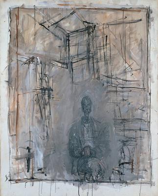
This should give any reader the idea that he does know what he’s talking about. Disturbed by the paintings? As anyone who has ever seen a Giacometti painting would know, they are merely extensions and elaborations of the theoretical concerns he explored in all his work, especially in the drawings and graphics, but in the sculptures as well.

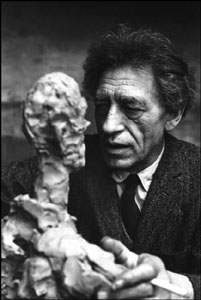
The agitated, pullulating surfaces of the late sculptures are physical manifestations of the idea that the figure confronting the artist (engaged in rendering what Giacometti called a “likeness”), is fundamentally unknowable, a phenomenological appearance without certain boundaries. This is what he meant when he was describing what occurred when his brother Diego sat for him: “He’s posed for me ten thousand times. When he poses I no longer recognize him.”

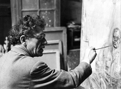
This understanding is the foundation of his drawing style, with its constantly searching, interrogating line. The presupposition of a drawing or painting by Giacometti is not “This is what I see”, but “Is this what I see?”

This was not adopted deliberately, but arrived at over a great deal of time, the essential product of his exploratory attitude to perceiving. Similarly, the faces in the figure paintings emerge out of an agitated architecture of gestural marks, which are the exact corollary of the pencil or etched line in the drawings.


Capon has also complained about the lack of recognition Giacometti has received in this country, almost alone among the twentieth century masters. He’s right, so it is precisely the paintings that we need to see.

This appeared in the Sydney Morning Herald:

“Capon, who has curated the show himself, explains why he hasn’t included any of Giacometti’s paintings. “You put one of his spindly, emasculated figures into a room and suddenly it defines the space,” he says. “The drawings do that, too, but the paintings don’t. I’m probably completely alone in thinking that, but that’s OK.”

Yes, I think you are Edmund.


This essential misunderstanding has left its mark on the show in other ways. The inclusion of several large standing figures, both male and female, and the prominent place they have been given is unfortunate, as these are some of the weakest works Giacometti ever completed. The reason is related to their theoretical underpinning, or lack of one. Several of them were done as commissions to furnish architechtural spaces and they are larger than life-size. The figures had to be that big in order to register within the dimensions of the outdoor space they would occupy. Unfortunately, this also undermined their reason for existing in the first place, which was as a record of a specific perception of a figure in space, its relation to the space around it and its distance from the perceiver.

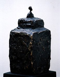
This is why many of the other figures are so small, and why they perch from various stands, plinths, steles, and so on. The platforms serve as distancing devices, their angled edges often mimicking the abstraction of perspective lines, indicating distance. The scale of a tiny figure balanced atop a massive broze platform is to approximate the sensation of beholding a figure from a distance, say, from across the street.


The large figures in the show don’t function like this. Your eyes (the artist’s eyes) don’t have the same relationship to the sculpture, with the result that they look mannered, their stylistic conventions forced. When the figures are larger than life-size, your eye-lines no longer match and the sense of perspective, as the space rushes away the further from the eye you get, is lost. The experience is therefore secondary, like the reproduction of a painting compared with the original.

It was also probably a waste of time to include the surrealist period sculptures, since this era is so rich and complex, that to have a few of the greatest hits belittles their importance to the history of surrealism and sells the artist short. Why not simply concentrate on the 1940s to the 60s, since this is where the show’s heart obviously is?

I was excited to be able to see all of the ‘Women of Venice’ reunited. The gallery has owned one for some time, but to my knowledge, I’ve never seen them all lined up together, like whores on parade, which is what they are.

‘Study of Apples’ (1952) – unmistakeably the son of Cezanne. They reveal a sculptor’s preoccupation with structure.

‘Standing Nude’ (1960) – a delicate pencil drawing. A female figure, like an apparition.

The various studies of rooms in pencil. These are images of the house of his mother and father, in Stampa, Switzerland. Heavy, rustic furniture. His mother sewing. Domestic objects never to be found in his studio, which was more like a monk’s cell. These drawings always look like a breath of fresh mountain air to me. It has always been my impression that on these trips back home, Giacometti took his bearings, spent some time in a caring, supportive domestic environment, re-energising his art in the process. It seems to me that his art always made real progress during, or just after, trips home. An eraser cuts through the line, like shafts of light falling on the tables, the heavy chandelier. Time slowed down. The products of intense scrutinising.


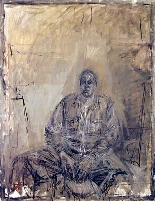
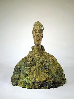
“Bust of a Man” (1950), “Head of Diego with Rolled Collar” (1951-52), “Bust of Diego” (1954), “Bust of a Woman [Diane Bataille]” (1945) – Surely nothing is as familiar as the human face, and yet here it is as if seen for the first time. Raw phenomena, nothing but an open confrontation with the living subject, an exchange, in the knowledge of impending death. I think of his friend Beckett’s lines: “I can’t go on. I’ll go on.”

Daniel Dorall update

As a result of a charming email from the artist Daniel Dorall, I have some more pictures to hand, which enabled me to properly update my previous post.

Like most reproductions, the pictures barely do the work justice, since most of the experience of seeing them is in the process of looking through the channels and following the threads.

Nice to hear from him though, and I look forward to seeing more work in the future.

‘Corridor’ by Daniel Dorall

Apologies for my absences lately. I’ve been extremely busy getting my head around the appalling industrial relations law that has now descended on this country, and reading and listening to first hand accounts of its effects on people. I’m helping to prepare a comprehensive report. Basically, if you’re Australian and you’re not disturbed by this stuff, you should be. If it hasn’t affected you or your family yet, just wait a little longer. It will be coming over the hill presently.

I am often amazed when I read blogs by actual honest-to-goodness writers who chat and ramble about their latest book/screenplay/whatever as if they have infinite reserves of time and energy and just can’t help themselves sitting at the keyboard for a few more hours. If I have spent a solid day at the desk, I’d rather stick sharpened pencils in my eyes than sit there for another minute once I get home. Which is why many many promising blog ideas slip sadly from my grasp and quietly sink below the waters before I have the energy to put them down here. I am a chronic procrastinator, and I think I recognize a fellow sufferer whenever I read a lengthy blog entry about something someone is writing or is going to write.

Still, the work of a dilettante is never done, and I did see a very interesting show last week and I’m determined to record my brief thoughts here.

It was called ‘Corridor’ and the artist was Daniel Dorall, at the energetic Red Gallery in North Fitzroy. Daniel makes small, elaborate architectural constructions out of cardboard and the kind of stuff that model making geeks use, like fake grass and little figurines. Imagine an architect’s model where the little plastic people are up to no good.

They sit on plinths, like models in a real estate developer’s showroom, and like the iconography of real estate they trade in dreams and aspirations, though these dreams are not the sort that most of us like to admit to having, at least in public.


The work called ‘Eden’ is a little maze of green walls within walls, with chambers connected to each other by tiny corridors too small for the figures to travel through. A little Adam and a little Eve relax langurously around a pool, appraising each other like starlets in a Beverly Hills hot tub, their plastic nakedness raising a smile. Meanwhile an immense snake curls itself menacingly in their direction, over and across the green hedges, breaking up the fun. It’s like some virus slithering its malevolent way through the channels and chambers of a body.

I was also touched by an unfolding narrative of persecution, brutality and addiction taking place in a nightclub and a gay bathhouse called ‘Babylon’.


The power of the metaphors carry the works over from potential kitsch into something much more affecting. Like the constructions themselves, the metaphor is multileveled. They are mazes, through space and maybe time, maybe the lives of the absurd figures that people them. They are cities, bodies, panels in a narrative, connected events in place and time. The walls imply separation, but with at least the possibility of connection through the narrow corridors. Our perspective is god-like, but the constructions reveal an attitude to us fallible humans that is always compassionate.

Gemma Nightingale – MAD Gallery

I’ve had it in mind for a while to get up to Lancefield and have a look at MAD Gallery, an exhibition space and cafe. I believe it’s been open for about 18 months, and doing quite well it seems.

Lancefield is a sleepy town, and not at all the sort of place you’d expect to come across a contemporary art space doing it’s best to represent some of the more interesting art activity in the central Victorian region, but here it is. Presently it’s showing Gemma Nightingale and Jocelyn Lu, who does high-key landscapes in colours that approach expressionist intensity. Unfortunately, they become undifferentiated after only a few minutes in their company, as if the relentless colour is motivated more by stylistic gesture than genuine emotion. The result is paradoxically a bit flat.

On the other hand, the paintings and sculpture by Gemma Nightingale acquire greater intensity the longer you look. The paintings, especially the smaller canvases, are rendered with great confidence and the sculptural installation is extremely wry and blackly funny.

The paintings are varied in size and format, but are unified by the use of black as a ground. This is difficult to pull off, as black can be the most inert colour on the palette, but she keeps the density of the pigment fluid by mixing in with vermillion and deep greens, keeping it moving, warmer and cooler by turns across the surface.

Grim forests rise up through thick, wet atmosphere in early morning winter light, that glows coldly through the branches. The trees have a slightly malevolent spikiness, which reminded me strongly of Sydney Long’s pastoral fantasies of the 1890s. The only thing missing is the prancing piper or woodland spirit. This is an appropriate link to make, as the great trees inhabit the pictures with an almost spiritual authority. Lacking figures, the trees are personified, and we imbue them with a living soulfulness.

The sculpture titled ‘The Flying Bride’ is a trio of bridal dresses, suspended above the ground as if caught in mid-twirl, all agitated movement and transparency. Only thing is, they are dull grey instead of bridal white, steel mesh in place of tulle, and corroded sheet metal cut to look like lace. They’re tethered by a chain, as if they might be in danger of floating off like magical figures from Disney’s ‘Fantasia’. And to underline the paradoxical joke, a bouquet of delicate steel flowers hang from the wall a little way off by a rusted chain, as if flung there by some extremely disenchanted bride. It’s called ‘Bridle Curb Chain Bouquet’; note the withering pun on ‘bridal’.

I was reminded of a strangely disconcerting poem by John Heath-Stubbs called ‘Mozart’:

“Mozart walking in the garden,
Tormented beside cool waters,
Remembered the empty-headed girl,
And the surly porters,

The singing-bird in the snuff box,
And the clown’s comic nose;
And scattered the thin blue petals
Of a steel rose.”

The overall impression of her show is bitsy, which is unnecessary as the stronger works command the space with such energy as to make the small, figurative pieces on paper look ill-considered and unconvincing by comparison.

Despite that, this is accomplished work, and I hope to see a more completely resolved installation by Gemma Nightingale in the future.

Postscript: I wasn’t there for the opening, but the invitation informs us that the opening of this exhibition featured live music by “Elston Gunn”. Is this a joke? I apologise if this really is the man’s name, but Elston Gunn was one of the stage names briefly tried on by the young Robert Zimmerman, a folk singer from Minnesota who later changed his name to Bob Dylan. Now that’s something I’d like to see in Lancefield.